Sunday, 30 November 2008
Depth and Traffic
Railway - Bo ke Le Van Si ( there is the mystery person which I do not know because it was really dark, I got him by accident in my photo)
aperture f11 - shutter speed 15 s - ISO 640 - 8 30 pm
Ong Lon Bridge - Nguyen Van Linh highway
aperture f11 - shutter speed 2 s - ISO 640 - 7 30 pm
Ong Lon Bridge - Nguyen Van Linh highway
aperture f11 - shutter speed 3 s - ISO 640 - 7 30 pm
Gia Dinh hospital - pedestrians bridge which cross over the No Trang Long street
aperture f22 - shutter speed 10 s - ISO 640 - 9 30 pm
Railway cross Le Van Si street
aperture f22 - shutter speed 10 s - ISO 640 - 9 30 pm
Railway - Bo ke Le Van Si
aperture f11 - shutter speed 10 s - ISO 640 - 8 30 pm
CHARACTERdesign-MISA
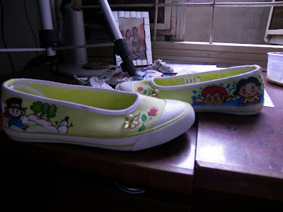
Shoes Illustrated Drawing
When life is hard to live, I also draw on shoes to earn extra money. These ones also based on my character design.
These are the painting I did with my customer's character ( they picked these from manga ).
Sunday, 23 November 2008
EXpressionism Art Movement
The scream
Eavard Munch, 1893
http://upload.wikimedia.org/wikipedia/en/f/f4/The_Scream.jpg
This is the famous painting by Edvard Munch, which is known as "the scream". The background and the subject is painted by the dark, mystery color with the exaggerated line to express the frightening feeling of the painting. I can feel that the artist has used his own experience, his own feeling and imagination to paint. Looked the picture, the viewer could feel like there is the scream that goes through their brain from their eyes.
Rehe im Walde
Franz Marc
http://upload.wikimedia.org/wikipedia/commons/3/32/Franz_Marc_020.jpg
This painting belongs to Franz Marc which is the Abstract Expressionism movement.
Toledo Die groben baluen Pferde
Franz Marc, 1911
http://en.wikipedia.org/wiki/Image:Franz_Marc_005.jpg
view of Toledo
El Greco. 1595-1610
http://en.wikipedia.org/wiki/Image:El_Greco_View_of_Toledo.jpg
Elbe Bridge
Rolf Nesch
http://en.wikipedia.org/wiki/Image:Rolf-Nesch-Bro-Over-Elben.jpg
AllUCANSHOP logo
All U Can Shop is the name of the online shop which is selling girl clothing and assessories. The owner of the shop is my friend and she asked me to design the logo for her. She wants to have something that cutting edge but simple.
My first idea is I am thinking about the name of the shop. It is definitely about shopping and I am thinking about the trolley. It looks somehow like the S shpae. So I tried to figure out the relationship of the trolley shape and the S shape. I did some sketching for my idea. I am also thinking about putting a crown on the top as the elegant symbol but it looks a bit eccentric and childish so I give up this idea.
So I talked to the owner about my idea, the trolley S shape. She is not really happy with this design, after some talking, I got that she wants the whole text of her shop as the logo ( just as her favorite brand DKNY or Diesel ). So I have to restart again.This time I am playing around with the text All You Can Shop. I am thinking that the customers always come at first so I want that the you need to be stand out from the rest, so I pick the bright gold, represents for the luxury on the dark grey background. I used two fonts to mess around for my logo which are Gill Sans MT Ex Con and Impact. I decided to put the text vertical way so it gets the stamp look. I played around with the tracking and leading until I pleased with the set up. And this is the final design for the All you Can Shop.
You guys could view and buy clothes by this link. They will deliver to your home if you buy more than 3 stuffs.
http://360.yahoo.com/profile-wyYOsqgwd6qzRHwsMcr2nGuz_8rL
Saturday, 15 November 2008
MISHA GORDIN-Conceptual Photography
Doubt
Misha Gordin, 1984-1987
http://www.art-photo.com/photo/gallery/misha/misha14.html
In the crowd collection, Misha Gordin has also applied the gestalt principles into his photos. He has used the similarity by letting the models wear the sample clothes to create the strong feeling for his concept. The proximity between the models are also tight so the image looks really heavy and dense. The closure principles help the viewer to form the group of models into the rectangle shape. The parallel steps at the background are also creating the horizontal blance for his image. His concept and his arrangement really make the viewer think deeply but just watching them.
Sunday, 9 November 2008
3D MAX DESIGN
This is the interior design of the login 108 coffee shop on Truong Dinh street, near the Tao Dan Park. My design is based on the requirement of the client that she wants to have the different space for different kind of customers and the number of them. So I devided the area into 3 separated part: the sofa for the group of 4 to 5 people, the long bar for the couple and the "cage" on the right side for the big group. The main tone is the lotus pink. I also designed the special ceiling by gesso with the shape of the key, the logo of the coffee shop.
These are the two karaoke room I designed for the director of the Thai An Department in District 12. She wanted to have two private karaoke room for her family with two different scenes for each room.
The first room, I got the idea from the space which is full of stars. I used the neonsign to create the star. The colourful decorating on the left side is for reducing the sound reflected on the wall and it also brings the rock feeling to the audience.
The second room is for the the luxury yacht which brings the audience into the luxury world in the yacht. I decided to do some sea painting on the wall and using the ships decorating ( the window, the wheel, the light etc. ) to bring the yacht feeling.
Gundam Robot Design based on the famous Japanese anime Gundam. Therefore the robot is really look alike as the robot character in the anime. I will try to draw the transformer next time when I have time and my 3D Max skill has improved.
Saturday, 8 November 2008
THE AMBIENCE around US
That is the source of inspiration for me to illustrate this picture. I want to represent the interactive between the reality and the unreality, the human and the machine, the nature and the artificial, also the icon and the image ( the cartoon character of me and my real picture ).
The background will represent a simple icon face, which built, from simple circle, rectangle and square. The icon will wear her own head phone to connect with the cassette . The messy map represents for the idea that I got, a lot of ideas come through my mind and a lot of mess also. The colorful parts on the low right is the beat, the temple of sound. The crazy robot head represents for the PC sound producing and his face looks really mad. The guy in colorful clothes represents for my personality. The sky is representing for the nature sound and the building represent for the human made sound.
HANDMADEPaperDrawer
When I have free time I like to design and make something useful and meaningful. This time I decide to make a small drawer so I could fill it with all the pins around my room.
This design actually concerns with the final design tutor in DIM 2 which I show the viewer how to make the gift box in seven steps. Unfortunately I could not upload the flash up but I like the idea of so I make the real one based on that seven steps.
- Idea and Sketching: As the basic steps for any design, the idea is very important and the users need to spend a lot of time on it. They need to do some research, learn about the box structure, how to use the basic skill in Illustrator and Photoshop etc. They also need to do some sketching draft paper so they could form what they want for their gift box (font, logo, color).
- Concept Development: After drafting on paper, now the time to develop the design. I will give one box design so the user could base on it make their box or they could follow my instruction and make one like mine.
- Design on the PC: As this step the users need to have some basic skills in Illustrator or they could draw on paper and scan into PC. They need to do technique drawing because making the box need the measurement.
- Printing: using thick paper as the requirement so that the box will be built up nicely. The print
- Paper cutting: The users need to spend a lot of time for this step.
- Box contributing: As this step, the user need to pay attention to the tutorial and make it really carefully.
- Final decorating: Using crystal or button to decorate on the final product. This step really depends on the eye of the users, make the final looks nice or not.
KIMIKO Yoshida
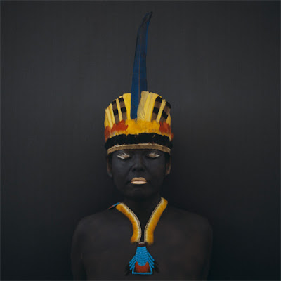
The images are portrait type. The collection has shown us the colorful and variety of the wedding clothes in all over the world. Different culture gives us different color, jewelry, clothes. The inspiration for the collection came from the memory of Kimiko about her arranged married when she was young, therefore those pictures are also her own story, her own life experienced. Kimiko pays extra attention to the facial expression, especially the eyes: the sadness face, the curious eyes of the bride when she is seeing her husband the first time in the arranged marriage, or it could be the pale face of the young girl who is not ready to marry etc. The expression of the eyes and the costumes has become the strong point of the picture which makes the viewer thinking carefully about the fairness of life, about destiny, the unlucky situation of the woman around the world. The artist talent and her fashion design experience have helped her to achieve the ideas about the brides’ pictures collection from different country:
You could view more a bout her art works and her background at link:
http://www.kimiko.fr/